[AIB] Clustering (+ PCA 개념)
✨ PCA , 주성분분석
주성분분석은 여러 개의 반응변수로 얻어진 다변량 데이터에 대해, 분산-공분산 구조를 선형결합식(주성분)으로 설명하고자 하는 분석 방식이다. PCA는 대표적인 차원 축소 알고리즘으로, 먼저 데이터에 가장 가까운 초평면(hyperplane, 또는 축)을 구한 다음 데이터를 이 초평면에 투영(projection)시킨다.
PCA는 데이터의 분산이 최대가 되는 축을 찾는다. 즉, 원본 데이터셋과 투영된 데이터셋 간의 평균제곱거리를 최소화하는 축을 찾는다.

위 그림에서 오른쪽 그림은 왼쪽의 2차원 데이터셋을 C1, C2 축에 대하여 투영하였을 때의 결과이다.
C1축으로 투영한 데이터가 분산이 최대로 보존되는 것을 확인할 수 있다.
주성분분석의 목적
1. 차원 축소
2. 변동이 큰 축 탐색
3. 주성분을 통한 데이터의 해석
주성분분석 프로세스
1. 학습 데이터셋에서 분산이 최대인 축을 찾는다.
2. 이렇게 찾은 첫 번째 축과 직교(orthogonal)하면서 분산이 최대인 두 번째 축을 찾는다.
3. 첫 번째 축과 두 번째 축에 직교하고 분산을 최대한 보존하는 세 번째 축을 찾는다.
4. 1~3과 같은 방법으로 데이터셋의 차원(feature) 수 만큼의 축을 찾는다.
예를 들면, 위의 그림에서 학습 데이터셋이 2차원 데이터이므로 PCA는 분산을 최대로 보존하는 단위벡터 C1이 구성하는 축과 이 축에 직교하는 C2가 구성하는 축을 찾게 되는 것이다.
주성분이란?
모평균 벡터와 모공분산 행렬을 가진 벡터가 선형결합이나 회전 변환을 통해 새로운 좌표축을 형성할 수 있다.
새로운 축은 데이터의 변동을 최대로 설명해주고, 공분산 구조에 대한 해석을 용이하도록 만들어줄 수 있는데,
이것을 주성분(PC, Principal Component) 이라고 한다.
1. 제 1 주성분
변동을 최대로 설명해주는 방향으로의 변수들의 선형결합식
2. 제 2 주성분
제 1 주성분 다음으로 변동을 가장 많이 설명해주는 변수들의 선형결합식
제 1 주성분과는 독립 (서로 직교관계)
✨ Scree plot
PCA 분석 후, 주성분 개수를 선정하기 위해 고유값-주성분의 분산 변화를 보는 그래프로,
고유값 변화율이 완만해지는 부분이 필요한 주성분의 개수이다.
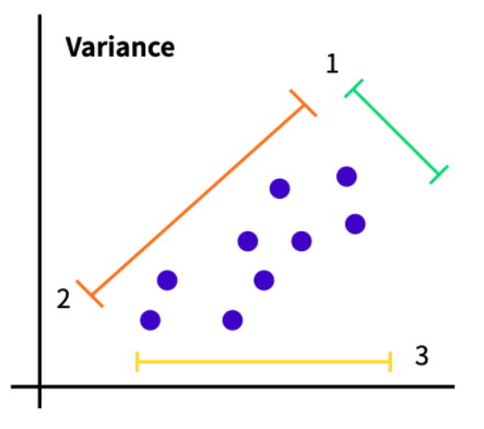
주어진 데이터들이 보라색 점들이라면, 1번 축, 2번 축, 3번 축으로 나누어서 차원 축소를 해줄 수 있다.
어떤 축으로 차원 축소를 하는 것이 더 분산이 클 지를 확인하여 차원 축소를 하는 것이 PCA 이다.
이때 어떤 축을 선택할 지 결정하기 위한 자료들 중 하나가 Scree plot이다.

분산이 큰 순서대로 PC1, PC2, PC3가 정해진다.
위의 데이터셋 그림에서 2번 축(orange)을 기준으로 투영했을 때의 분산이 가장 크기 때문에 2번 축이 PC1이 된다.
✨ Scree plot 예제
import matplotlib.pyplot as plt
import seaborn as sns
import pansdas as pd
import numpy as np
%matplotlib inline
from sklearn.datasets import make_blobs
from sklearn import decomposition
# 등방성 가우시안 정규분포를 이용한 가상 데이터 생성
# random하게 simulation data 생성
# 4개의 cluster를 갖는, 표준편차가 2이고 독립변수가 10개인 데이터
X1, Y1 = make_blobs(n_features=10, n_samples=100, centers=4, random_state=4, cluster_std = 2)
# 반환값 >>>
# X = [n_samples, n_features] 크기의 배열, Y = [n_samples] 크기의 배열
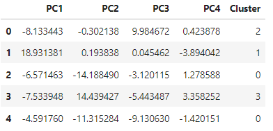
pca = decomposition.PCA(n_components=4) # 주성분 4개로 설정
pc = pca.fit_transform(X1)
pc_df = pd.DataFrame(data=pc, columns=['PC1', 'PC2', 'PC3', 'PC4']
pc_df['Cluster'] = Y1
pc_df.head()output :
def scree_plot(pca):
    num_components = len(pca.explained_variance_ratio_)
    ind = np.arange(num_components)
    vals = pca.explained_variance_ratio_
    # pca.explained_variance_ratio_ :
    # 각각의 주성분 벡터가 이루는 축에 투영(projection)한 결과의 분산 비율 = 각 Eigenvalue의 비율

    ax = plt.subplot()
    cumvals = np.cumsum(vals)	# 배열 누적합 계산
    ax.bar(ind, vals, color=['#00da75', '#f1c40f',  '#ff6f15', '#3498db'])	# bar plot
    ax.plot(ind, cumvals, color='#c0392b')	# line plot

    # 그래프에 주석 달기
    for i in range(num_components):
    	ax.annotate(r"%s" % ((str(vals[i]*100)[:3])), (ind[i], vals[i]), va='bottom', ha='center', fontsize=13)
        # text, text 위치, vertical alignment(수직방향), horizontal alignment(수평방향), fontsize

    ax.set_xlabel("PC")
    ax.set_ylabel("Variance")
    plt.title("Scree plot")

scree_plot(pca)
output :
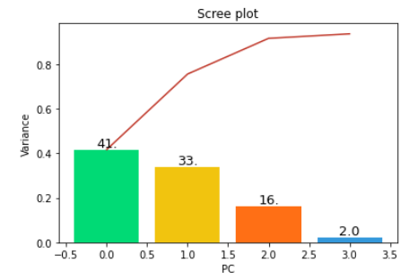
위의 결과는 41%가 첫 번째 주성분 축에 놓여 있고, 33%가 두 번째 주성분 축에 놓여 있다는 것을 말한다.
네 번째 주성분 축에는 2% 정도로 적은 양의 정보가 놓여 있다는 것을 알 수 있다.
따라서 첫 번째 두 번째 세 번째 주성분을 이용하여 10차원 데이터를 3차원으로 투영할 경우,
원본 데이터셋의 분산에서 약 90%의 정보를 얻을 수 있다.
cf.
# pyplot 주석 달기
1) vertical alignment
  - center : 수직방향으로 좌표 중앙에 놓임
  - top : 좌표가 텍스트 위에 놓임
  - bottom : 좌표가 텍스트 아래 놓임
  - baseline : 텍스트의 baseline 에 따라 달라짐


2) horizontal alignment
  - center : 수평방향으로 좌표 중앙에 놓임
  - left : 좌표가 텍스트 왼쪽에 놓임
  - right : 좌표가 텍스트 오른쪽에 놓임
Scree plot 예시
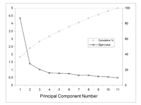
위 그림은 가로축은 주성분의 개수, 세로축은 Eigenvalue(고유값)과, 누적비율을 나타낸다.
Scree plot을 통해서 찾고자 하는 것은 최소값이 아닌 최적의 값이다.
비용(cost)을 최소화하면서 같은 결과를 낼 수 있는 최적의 값을 찾아야 한다.
Scree plot으로 주성분 개수를 구분하는 방법은 기울기가 완만하게 변하는 구간을 기점으로 선택해주면 된다.
기울기가 가장 작을 때를 reflection point 라고 말한다.
그래프에서 확인하기가 애매한 경우에는 고유값과 누적비율을 확인하면 된다.
보통 Eigenvalue값이 1 이상이 되도록 설정하는데 무조건 1이 넘는 것을 선택하는 것은 아니다.
Eigenvalue값이 1에 가까우면서 누적비율이 가장 높은 것이 있다면 해당 개수를 선택하면 될 것이다.
위의 예시에서는 주성분의 개수를 4개로 설정해볼 수 있다.
reference
https://m.blog.naver.com/hsj2864/220613527515
R - 주성분분석
주성분분석(PCA : Principal component analysis)에 대해서 정리해보겠다. 내용이 방대하다보니 요약설...
blog.naver.com
https://excelsior-cjh.tistory.com/167
차원 축소 - PCA, 주성분분석 (1)
차원 축소 - PCA (1) 대부분 실무에서 분석하는 데이터는 매우 많은 특성(feature)들을 가지고 있다. 이러한 데이터를 가지고 머신러닝 알고리즘을 적용해 문제를 해결하려고 한다면, 데이터의 차원
excelsior-cjh.tistory.com
5.2 분류용 가상 데이터 생성 — 데이터 사이언스 스쿨
.ipynb .pdf to have style consistency -->
datascienceschool.net
https://pyvisuall.tistory.com/52
[파이썬 matplotlib] 그래프 텍스트 정렬하기
[파이썬 matplotlib] 그래프 텍스트 정렬하기 그래프에 추가한 텍스트를 정렬하는 옵션은 두가지가 있습니다. 하위 항목은 선택할 수 있는 옵션을 의미합니다. 1) verticalalignment - center : 수직방향으
pyvisuall.tistory.com
✨ Machine Learning
💡 지도 학습 (Supercised Learning)
훈련 데이터에 라벨(답)이 있을 때 사용할 수 있다.
- 분류 (Classification) : 주어진 데이터의 카테고리 혹은 클래스 예측을 위해서 사용된다.
- 회귀 (Regression) : continuous한 데이터를 바탕으로 결과를 예측하기 위해서 사용된다.
💡 비지도 학습 (Unsupercised Learning)
- 클러스터링 (Clustering) : 데이터의 연관된 feature를 바탕으로 유사한 그룹을 생성한다.
- 차원 축소 (Dimensionality Reduction) : 높은 차원을 갖는 데이터셋을 사용하여 feature selection / extraction 등을 통해 차원을 줄이는 방법이다.
- 연관 규칙 학습 (Association Rule Learning) : 데이터셋의 feature들간의 관계를 발견하는 방법이다.
- 강화 학습 (Reinforcement Learning) : 머신러닝의 한 형태로, 기계가 좋은 행동에 대해서는 보상을, 그렇지 않은 행동에는 처벌이라는 피드백을 통해서 행동에 대해 학습해나가는 방식이다.
✨ Clustering
클러스터링은 비지도 학습 알고리즘의 한 종류이다.
Clustering의 목적
클러스터링이 대답할 수 있는 질문은 주어진 데이터들이 얼마나, 어떻게 유사한지 이다.
그렇기 때문에 주어진 데이터셋을 요약, 정리하는데 있어서 매우 효율적인 방법들 중 하나로 사용되고 있다.
그러나 동시에 정답을 보장하지 않는다는 이슈가 있어 production의 수준 혹은 예측을 위한 모델링에 쓰이기 보다는 EDA를 위한 방법으로 많이 쓰이고 있다.
Clustering의 종류
1. Hierarchical
- Agglomerative : 개별 포인트에서 시작 후 점점 크게 합쳐감
- Divisive : 한 개의 큰 cluster에서 시작 후 점점 작은 cluster로 나눠감
2. Point Assignment
- 시작 시에 cluster의 수를 정한 다음, 데이터들을 하나씩 cluster에 배정시킴
3. Hard vs Soft Clustering
- Hard Clustering에서 데이터는 하나의 cluster에만 할당된다.
- Soft Clustering에서 데이터는 여러 cluster에 대한 확률을 가지고 할당된다.
일반적으로 Hard Clustering을 Clustering 이라 칭한다.
✨ K-Means Clustering 예제
프로세스
1. k개의 랜덤한 데이터를 cluster의 중심점으로 설정
2. 해당 cluster에 근접해 있는 데이터를 cluster로 할당
3. 변경된 cluster에 대해서 중심점을 새로 계산
4. cluster에 유의미한 변화가 없을 때까지 2~3 반복
import pandas as pd
import matplotlib.pyplot as plt
from sklearn.datasets import make_blobs
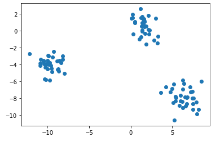
x, y = make_blobs(n_samples=100, centers=3, n_features=2)
df = pd.DataFrame(dict(x=x[:, 0], y=x[:, 1], label=y))
colors = {0 : '#eb4d4b', 1 : '#4834d4', 2 : '#6ab04c'}
fig, ax = plt.subplots()
grouped = df.groupby('label')
for key, group in grouped:
group.plot(ax=ax, kind='scatter', x='x', y='y', label=key, color=colors[key])
plt.show()output :

df.head()output :

points = df.drop('label', axis=1)	# label 컬럼 삭제

plt.scatter(points.x, points.y)
plt.show()
output :
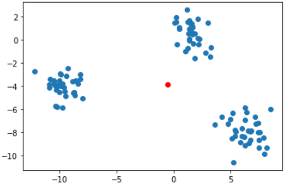
중심점 (Centroid) 계산
centroid란, 주어진 cluster 내부에 있는 모든 점들의 중심 부분에 위치한 점이다.
dataset_centroid_x = points.x.mean()
dataset_centroid_y = points.y.mean()

ax.plot(points.x, points.y)
ax = plt.subplot(1, 1, 1)
ax.scatter(points.x, points.y)
ax.plot(dataset_centroid_x, dataset_centroid_y, 'or')	# red circle
plt.show()
output :
랜덤한 포인트를 가상 cluster의 centroid로 지정
# k-means with 3 cluster
centroids = points.sample(3)
ax = plt.subplot(1, 1, 1)
ax.scatter(points.x, points.y)
ax.plot(centroids.iloc[0].x, centroids.iloc[0].y, 'or') # red circle
ax.plot(centroids.iloc[1].x, centroids.iloc[1].y, 'oc') # cyan circle
ax.plot(centroids.iloc[2].x, centroids.iloc[2].y, 'oy') # yellow circle
plt.show()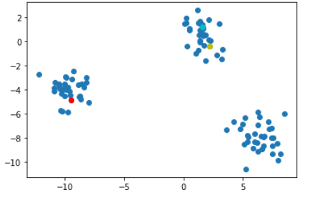
import math
import numpy as np
from scipy.spatial import distance

def find_nearest_centroid(df, centroids, iteration):
	# 포인트와 centroid 간의 거리 계산
    distances = distance.cdist(df, centroids, 'euclidean')

    # 제일 근접한 centroid 선택
    nearest_centroids = np.argmin(distnaces, axis=1)

    # cluster 할당
    se = pd.Series(nearest_centroids)
    df['cluster_' + iteration] = se.values

    return df
first_pass = find_nearest_centroid(points.select_dtypes(exclude='int64'), centroids, '1')
first_pass.head()output :

def plot_clusters(df, column_header, centroids):
colors = {0 : 'red', 1 : 'cyan', 2 : 'yellow'}
fig, ax = plt.subplots()
ax.plot(centroids.iloc[0].x, centroids.iloc[0].y, "ok") # 기존 중심점, black circle
ax.plot(centroids.iloc[1].x, centroids.iloc[1].y, "ok")
ax.plot(centroids.iloc[2].x, centroids.iloc[2].y, "ok")
grouped = df.groupby(column_header)
for key, group in grouped:
group.plot(ax = ax, kind = 'scatter', x = 'x', y = 'y', label = key, color = colors[key])
plt.show()
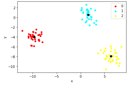
plot_clusters(first_pass, 'cluster_1', centroids)output :

def get_centroids(df, column_header):
new_centroids = df.groupby(column_header).mean()
return new_centroids
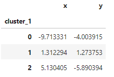
centroids = get_centroids(first_pass, 'cluster_1')
centroidsoutput :
# 변경된 cluster에 대해 centroid 계산
second_pass = find_nearest_centroid(first_pass.select_dtypes(exclude='int64'), centroids, '2')
plot_clusters(second_pass, 'cluster_2', centroids)
output :

centroids = get_centroids(second_pass, 'cluster_2')
third_pass = find_nearest_centroid(second_pass.select_dtypes(exclude='int64'), centroids, '3')
plot_clusters(third_pass, 'cluster_3', centroids)
output :

centroids = get_centroids(third_pass, 'cluster_3')
fourth_pass = find_nearest_centroid(third_pass.select_dtypes(exclude='int64'), centroids, '4')
plot_clusters(fourth_pass, 'cluster_4', centroids)
output :
centroids = get_centroids(fourth_pass, 'cluster_4')
fifth_pass = find_nearest_centroid(fourth_pass.select_dtypes(exclude='int64'), centroids, '5')
plot_clusters(fifth_pass, 'cluster_5', centroids)
output :

# 유의미한 차이가 없을 때까지 반복
# np.array_equal
# -> numpy 배열이 같은 형상이면서 같은 원소값들인지 확인
convergence = np.array_equal(fourth_pass['cluster_4'], fifth_pass['cluster_5'])
convergence
output : True
✨ K-means with Scikit-learn
K-means에서 K를 결정하는 방법
- The Eyeball Method : 사람의 주관적인 판단을 통해서 임의로 지정하는 방법
- Metrics : 객관적인 지표를 설정하여 최적화된 K를 선택하는 방법
from sklearn.cluster import KMeans

kmeans = KMeans(n_clusters=3)
kmeans.fit(x)
labels = kmeans.labels_

print(labels)
output :

new_series = pd.Series(labels)
df['clusters'] = new_series.values
df.head()
output :

centroids = get_centroids(df, 'cluster')
plot_clusters(df, 'clusters', centroids)
output :

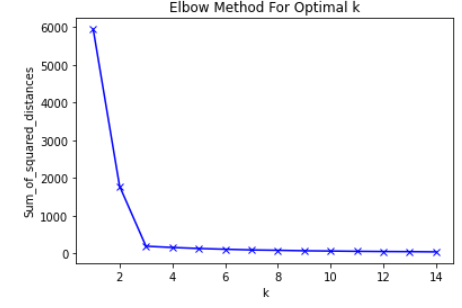
✨ Elbow Methods
sum_of_squared_distances = []

K = range(1, 15)

for k in K:
	km = KMeans(n_clusters=k)
    km = km.fit(points)
    sum_of_squared_distances.append(km.inertia_)


plt.plot(K, sum_of_squared_distances, 'bx-')
plt.xlabel('k')
plt.ylabel('Sum_of_squared_distances')
plt.title('Elbow Method For Optimal k')
plt.show()
output :